The Idea
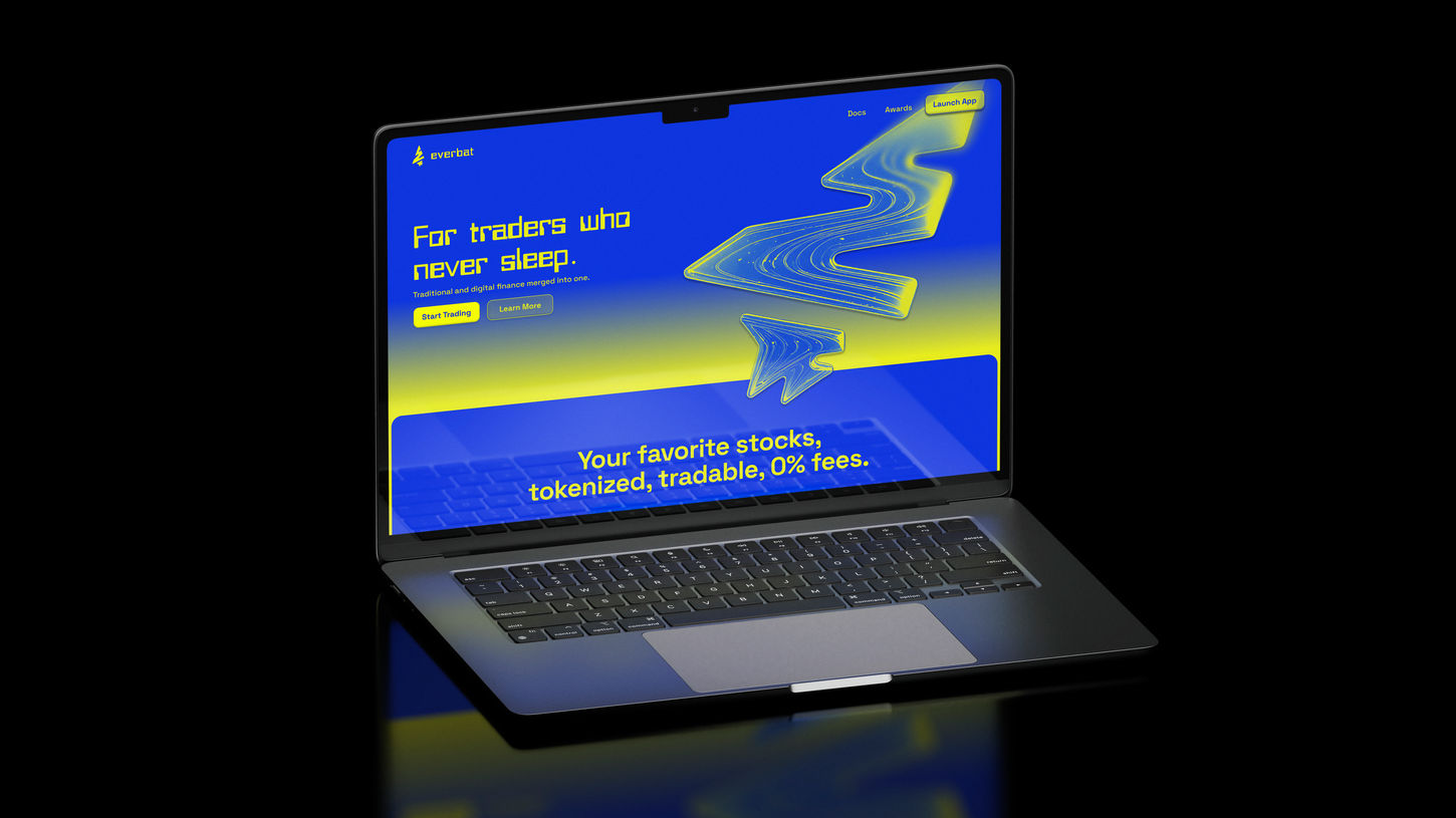
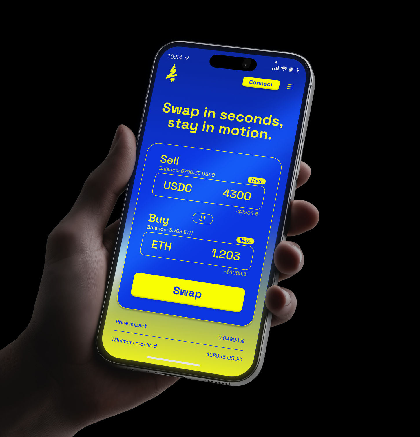
Everbat set out to merge traditional and digital finance into one seamless platform, built for “traders who never sleep.” Our focus was on designing a sharp landing page and an intuitive quick swap app that embodied speed, trust, and accessibility. At the core of the identity is the logo: a lightning-shaped form that also resembles a bat hanging upside down—symbolizing vigilance, power, and a presence that never rests.
The Challenge
Trading platforms often fall into extremes: overly technical and intimidating for new users, or too simplistic for professionals. Everbat needed a UX/UI design that struck the right balance—delivering the efficiency and clarity of traditional finance while introducing the bold, high-energy aesthetic of Web3. The challenge was to make complex token swaps feel effortless, while ensuring the landing page communicated professionalism and innovation at a glance.
The Solution
We designed a landing page that serves as Everbat’s front door: bold, fast-loading, and built to immediately communicate trust and innovation. For the quick swap app, we created a streamlined interface where users can trade assets with confidence in just a few clicks. Clean layouts, intuitive flows, and responsive interactions make the experience seamless, while kinetic gradients and brand elements reinforce the platform’s sense of energy and nonstop motion. Together, these designs position Everbat as a trading solution that feels modern, approachable, and alive.


